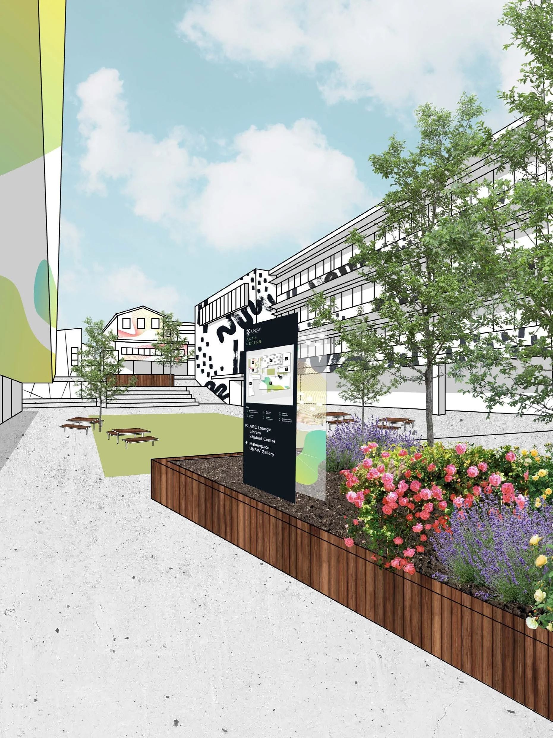
UNSW Wayfinding System

2020

branding, illustration

About

Bridget Kennedy's contemporary jewellery and object studio is solo-run and highly known for her sustainable practice. Due to the global pandemic in 2020, society was moving rapidly online. Bridget's website was in need of an update to keep up with the increase in digital traffic and a recent rebranding.

Goal

Redesign a content-heavy website to improve responsiveness and user experience. The aesthetic should be minimal yet engaging and highlight the artist’s work.

Typefaces

Nunito

Colour Palette

HEX #C3C6B1
RGB 195 198 177

HEX #FFF
RGB 255 255 225

HEX #EDA36C
RGB 237 163 108

HEX #111
RGB 17 17 17

HEX #DDD
RGB 221 221 221

Before

The website had a large volume of written content and a cluttered layout, making it difficult to navigate, especially on mobile devices. It also lacked clarity in its purpose: was it a shop or a blog?

After

I organised the website into fewer navigation links and grouped page content into sections to make reading flow easier.

A new hero image highlighted Bridget’s shopfront, showing that her work was indeed for sale, among other things, such as presenting her portfolio and hosting workshops.

An introduced accent colour (mint green) communicated a sustainable practice where words couldn’t.

In order to keep the clean and minimal aesthetic, we opted for a subtle collage style where images and content boxes would be offset or overlapped.

Previous
Previous

Bridget Kennedy