Transcendence
2021
website, illustration, animation, spatial, sound
About
Transcendence is my final-year honours project from university. It combines my majors, graphics and spatial design, into a conceptual sensory space that aims to connect the audience with Nature in a way that simultaneously eases symptoms of anxiety. This was a personal issue in need of relief, especially during the aftermath of 2020’s global pandemic.
Goal
Design and present a spatial concept about natural and organic forms using only digital media, as physical installations were not possible during this time. The final project needed to be as immersive as possible using the tools I had.
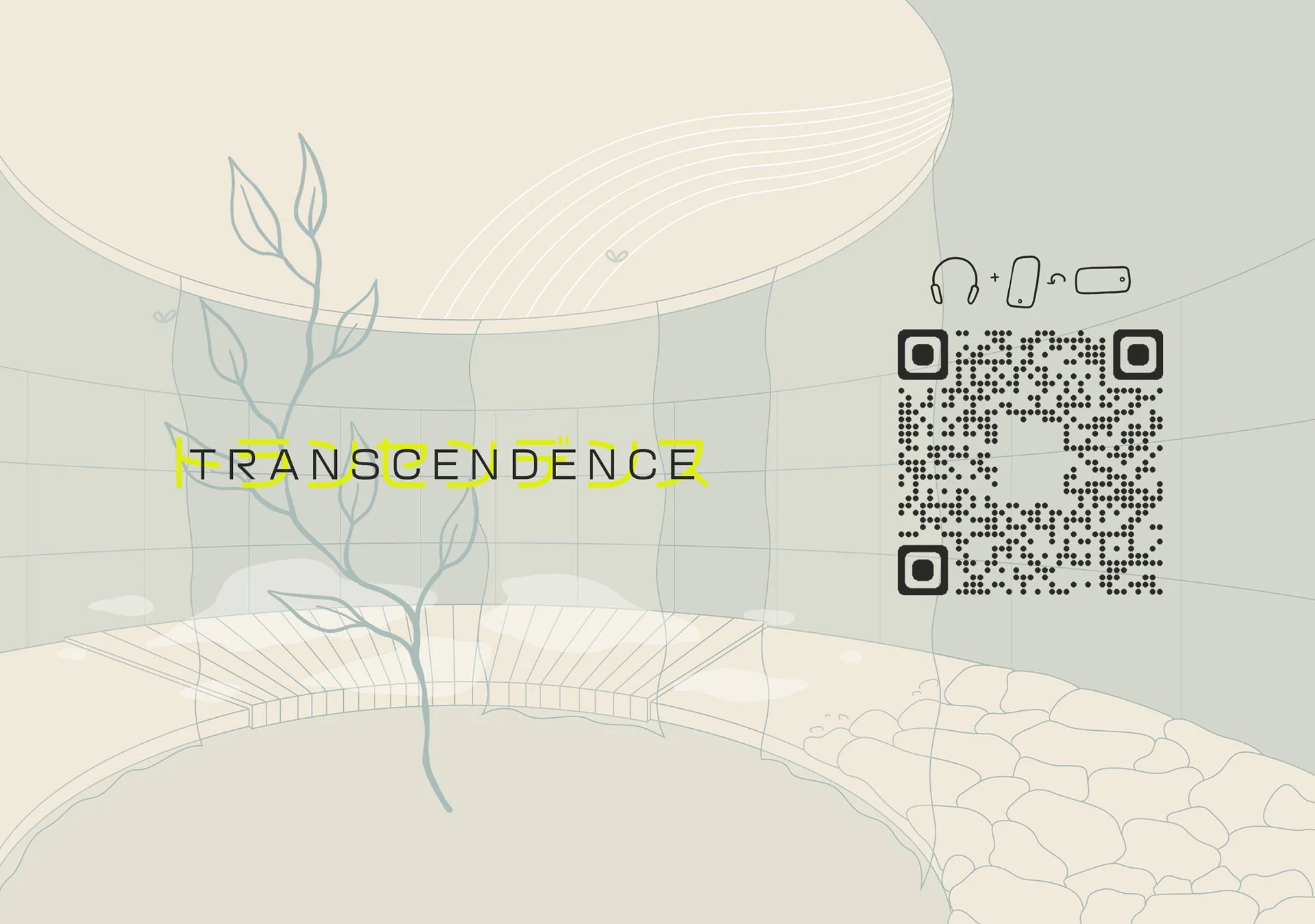
Scan the QR code or click the image below to visit Transcendence.
Headphones and landscape viewing are recommended.
Artist Statement
Transcendence is a spatial concept that gradually transports individuals through an immersive experience of Natural and organic forms, using a blend of digital and physical media. Referencing techniques in immersive technology and Salutogenics, we gain insight into how activating the 5 senses allows us to effectively connect to an environment, in a way that develops a deeper understanding of our reality. Similar to techniques used for anxiety, the result is grounding and draws you into the present moment, making it beneficial even when not experiencing distress.
Inspired by noticing the details in Nature, visitors to Transcendence are first introduced to non-visual senses - auditory, olfactory and tactile - all while following a winding, rising trail. Translucent curtains intermittently drape the trail like soft walls that respond to movements and breezes that pass by. As the trail progresses, the curtains transition into solid panels, and individuals would have endured the physical yet grounding effort it takes to walk up an incline. This, combined with the other non-visual senses collected along the way, creates a gradual transportation towards full immersion. As a sensory climax, projected visuals are introduced in a final room, specific to the sounds and smells experienced prior. The circular layout encases visitors in 360 degrees of visuals, in a space free of time and society’s fast-paced mindset. With a shared entrance and exit, individuals are transported out in the opposite motion to entering. It is as if retracing their steps, easing down the trail, exhaling back into reality.
Rather than the typical architectural pin-up, this spatial concept is presented through two digital posters that focus on the experience. The majority of the project, including spatial and graphic design, is influenced by environmental observations and physical drawing, yet is presented digitally. In addition, Japanese katakana is incorporated, further symbolising the future, digitalisation, wabi sabi and minimalism. These highlight the blurred divide between physical and digital realms. Overall, the interactive and scrolling motion of the posters creates a somewhat meditative experience that replicates that of the physical installation.